A brand people remember, on every card, sign and screen.

A logo file on its own is of little use. What you receive is a complete identity in one folder, with the rules that let your printer or your sign-maker apply it the same way every time. It is drawn by hand, by me, and it is yours outright.

A fixed price, agreed in writingThree to five weeksThe copyright is yours

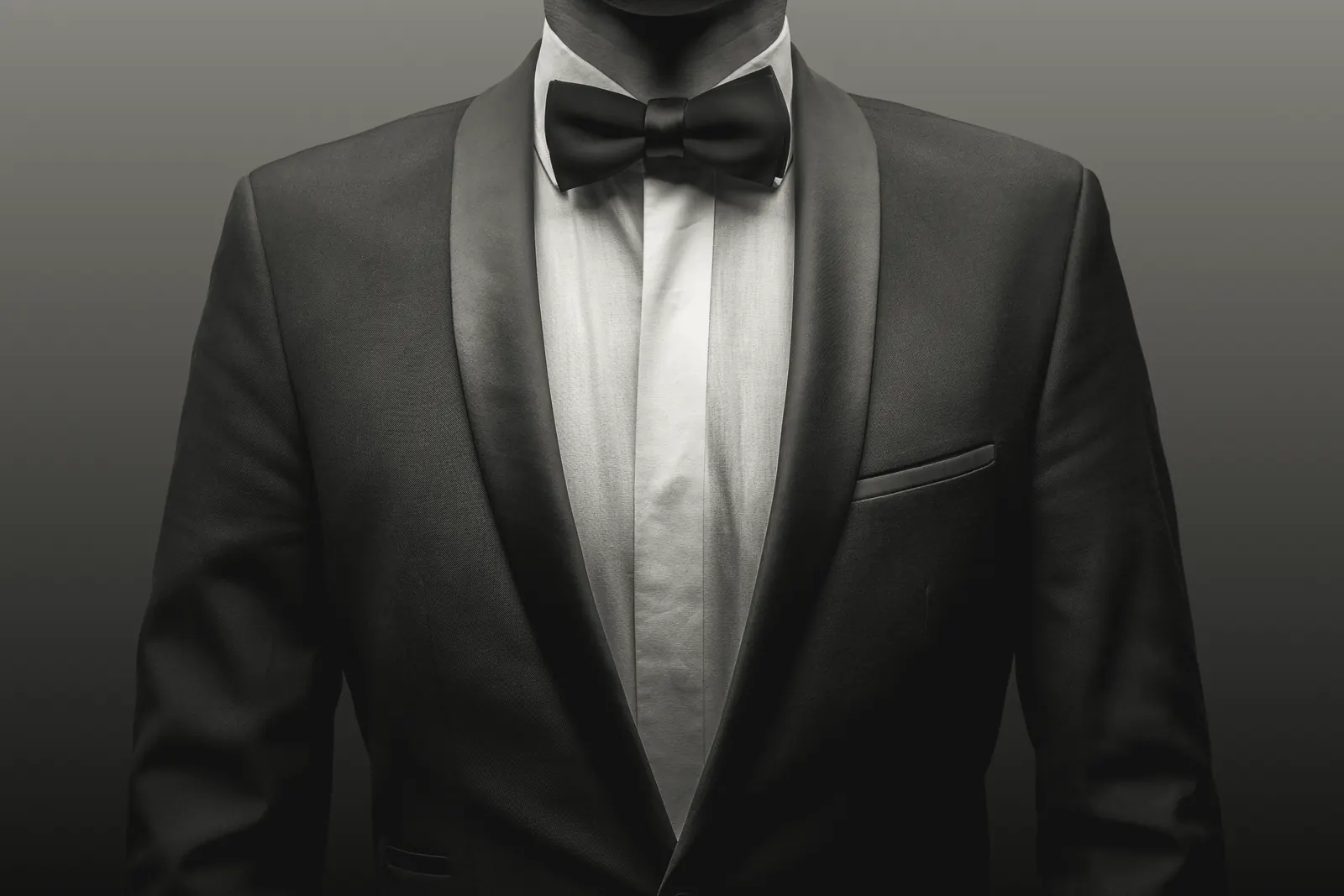
A dinner jacket with a satin shawl collar, a white dress shirt and a black bow tie, in black and white

Every identity leaves here as a book.

It arrives as a PDF or a web page that anyone who ever touches the brand can pick up and follow, from a new member of staff to the printer of your next sign.

Should you need only the logo, the book is shorter, and so is the price. If you already have a logo and need the rest of the system built around it, that is a common commission, and you are welcome to send me what you have.

The folder

What it holds at handover, with the book

The mark
The primary logo, secondary lockups, a monogram for square spaces and reversed versions, in every format your printer or developer will ask for.
The colours
Print and screen values, with the rules for combining them.
The type
Faces, weights, sizes and pairing rules, from foundries you can license for good, or faces that are genuinely free.
Visual language
The patterns, shapes and style of photography that make you recognisable before anyone reads the name.
The voice
One short guide to how you sound, with sample headlines, sign-offs and posts.
Templates
Letterhead, an email signature, social media templates and business card artwork, so that the brand is in use the day after handover.

The book, open at a real one.

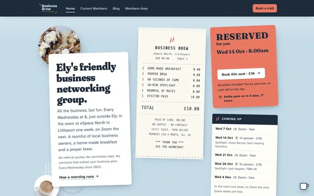
Business Brew is the networking group I run in Ely, and it meets every Wednesday at eight. Because I run it, I can open its book here, page by page.

Its mark is the name in a soft, heavy face with two curls of steam above it. The book sets out the clear space around the mark, the smallest size at which it may be printed and what must never be done to it, because it has to hold as well on the side of a van as at the size of a favicon. The four colours are the ones in the mark, each with its Pantone, CMYK, RGB and hex values, checked for accessibility as well as taste.

Business Brew

Headings are set in Fraunces, a free face chosen because it comes closest to the lettering in the mark, and the body in Atkinson Hyperlegible Next, a face drawn for legibility first.

Both are at work on the group's website, the first real thing to wear the brand. I built it to the same identity, with the voice in every line: “All the business, but fun.”

Visit the site (opens in a new tab)
Part of the Business Brew homepage: A Wednesday, minute by minute, its headings set in the brand's heavy, soft display face, from Kettle's on at eight to Off to work at half past nine

Three to five weeks, from the first call to the folder.

That is long enough to think properly, and short enough to keep the work moving.

  1. 1Discover, in the first week

    We begin with a proper conversation about your business, your customers and who you are up against, and about the words you would use and the ones you never would. Mood boards follow, together with a short written brief that you sign off before any design begins.

  2. 2Concept, in weeks two and three

    You are shown two, sometimes three, genuinely different directions: not small variations on one idea, but different routes your brand could take, each shown in context, on a sign and on a phone screen. It is the longest stage, because it is the one that matters most.

  3. 3Refine, in week four

    The direction you choose is sharpened, tested at every size from the icon in a browser tab to a shop sign, and grown into the full system: colour, type, voice, patterns and examples of it in use.

  4. 4Deliver, in week five

    You receive the final files in every format, the book and the templates, with a one-hour walk-through of all of it.

  5. 5A quiet 30 days afterwards

    This is a window for small adjustments once the brand is in everyday use, because the first week of a new brand always turns up something nobody thought of.

Marks drawn here, worn every day.

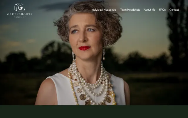
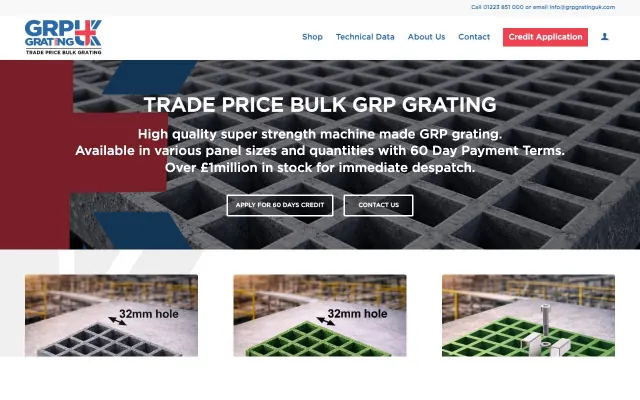
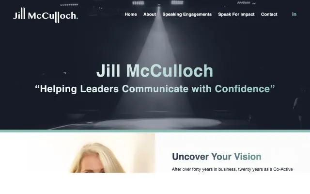
Each began as a blank page in this studio, and each is shown here at work on its own website rather than in a frame.

“Adam listened carefully and understood the aims and values of SupplyFinder, and he then communicated those values through digital design.”
Lord JD WaverleySupplyFinder

Cost, ownership, and what happens if you do not like it.

These are the questions that arise on almost every first call about a logo or a brand, the awkward ones included. If you are choosing on behalf of a board, the partners or a committee, the assurances they will ask for are in place: professional indemnity insurance, references you are welcome to speak to, and purchase order numbers with 30-day terms on request.

How much does a logo or a brand cost?

Every brand is quoted to the job, because no two businesses need quite the same thing. After a free 30-minute call you receive a written proposal within two working days, with one fixed price and the dates. The price holds however long the work takes, and should the scope change, the new price is agreed in writing before the extra work happens.

Who owns the logo and the brand?

You do. Full copyright passes to your business when the final invoice is paid. You receive the editable source files, every version of the mark, and the right to use, change or license the work however you wish, for good.

What if I do not like any of the concepts?

It is rare, but it happens. The discovery stage exists so that we agree what we are aiming at before anything is drawn, which is also why you see two, sometimes three, genuinely different directions rather than five near-identical ones. If we have still not arrived at the right direction, we return to the brief together, rather than refining one that does not suit you.

Will you use AI to design it?

No. The thinking, drawing, typesetting and refining are done by hand, by me. I use AI for administration and the occasional early mood board, but the work you pay for is human.

Do you do brand refreshes?

Yes. Keeping what works and sharpening what does not is often the right course when a brand has a following but feels tired, and a refresh is quoted separately from a full rebrand.

Can you put the new brand on the website too?

Yes, and about half of brand projects are paired with a website rebuild. The website is the first place a new identity is put to proper use, and commissioning the two together is the more economical course, so they are quoted as one combined project.

Tell me what you would like people to feel when they see your name.

You are welcome to book thirty minutes on a call, or to leave a note in the form about what the business does and what troubles you about the look it has now. You can expect a genuinely personal service: I read every message myself and reply by the end of the next working day, and should you prefer to meet rather than talk on Zoom, I will come to you. If I am not the right fit, I will tell you so.

Or write to enquiries@adamlord.co.uk. For a fuller picture, the project brief takes about ten minutes.

Tell me about your brand

Please add your name, so that I know who I am replying to.

That email address does not appear to be complete. Would you mind checking it?

Your message comes straight to me, and your details are used only to reply to it, never added to a list or passed on.

Thank you. Your message is with me.

It has come straight to me rather than to a queue, and I will reply by the end of the next working day.

Book a 30-minute call