Nobody goes shopping for a post-surgery bra. It was the thought I returned to again and again while building this one.
People arrive at Reco Heart with a date already in the diary: a mastectomy, a reconstruction, an implant removal, heart surgery. Often they are a few days away, arranging it around everything else that week, and they are not really shopping at all. They are trying to work out what happens next.
That is why most of this commission turned out not to be the shop.
| Client | Reco Heart |
|---|---|
| What they make | The Reco Bra, a front-fastening recovery bra and a Class 1 medical device |
| Platform | WordPress and WooCommerce, with a bespoke theme in place of a page-builder template |
| What I did | Strategy, information architecture, design, the build, the migration, search and analytics |
| The website | recoheart.com (opens in a new tab) |

Start with the operation, not the product.
The old site had one product page and left everybody to find their own way to it. Yet somebody facing a mastectomy and somebody having implants removed are in entirely different situations, and each wants different questions answered before they will trust you with anything.
So the site now has a route for each: a page on bras after breast cancer surgery (opens in a new tab), one for cosmetic and plastic surgery (opens in a new tab), one for lipofilling and fat transfer (opens in a new tab), and one on choosing a bra after implant removal (opens in a new tab).
Each opens in the same way, with a section headed “what the next few weeks may look like”, and then walks through those weeks in order:
- Choose your size early.
- The bra goes on early.
- Swelling, dressings, rest.
- Everything gradually settles.
- Your follow-up decides what happens next.
What I admire in these pages is how specific they are allowed to be. The explant page has a heading that says simply “the first look in the mirror can be hard, even when you are certain”, and then speaks to it. It explains why fixed cups do not work when your shape is going to keep changing. At that point it is not selling at all. It is telling somebody what is coming, which is what they came for.
A recovery hub arranged around where you are, not around what the shop sells.
Then there is the recovery advice hub (opens in a new tab), the part I would point to if anyone asked what this site is really for.
It is arranged in the five stages people actually move through: just diagnosed, preparing for surgery, the first days after, weeks two to six, and longer-term healing. The last of these exists because recovery does not obligingly stop at six weeks, whatever the leaflet says. You go to the stage you are in and read what matters this week, rather than working through everything.
The guides beneath are properly written rather than padded out for Google. “How to sleep after breast surgery” covers setting up the bed, the bedside kit, getting in and out of bed and sleeping with drains in, and then, most usefully, a section headed “the 2am worries, answered plainly”, followed by one on when to ring somebody rather than wait until morning. Others cover what to pack in your hospital bag, how long you actually need to wear a post-surgery bra, and VAT relief.
Every guide ends with its sources, and the whole hub is free, with no sign-up and nothing kept behind a form. That matters more than it might seem. Somebody two days from an operation, awake at half past one in the morning, is not going to fill in a form to find out how to sleep.
The page that sends people somewhere else.
My favourite part of the whole site is a section of the advice hub headed “organisations, charities and specialists Nicole recommends”, in which Nicole de Havilland, a lymphoedema practitioner of more than thirty years and the designer of the bra itself, points people towards things Reco Heart does not sell and makes nothing from.
There are surgical drain bags that hang from the shoulder so that you need not lift your arms, designed by a patient, with the profits going to Prevent Breast Cancer. There is a stand-to-pee device, because getting on and off a toilet after abdominal surgery is genuinely difficult and nobody warns you. There are soft wool pads from a supplier in Europe, priced in euros, with a note asking you to check with your surgical team before putting anything over a healing wound.
And there is a whole block on lymphoedema, which the page introduces as the part of recovery least likely to be explained to you properly: the national support charity, a therapist finder you can search by postcode, two mini guides, compression sleeves in patterns somebody might actually want to wear, and a specialist surgical practice for people who have been told surgery is an option. It ends with Future Dreams, the breast cancer support centre in King's Cross.
The introduction to all of it reads:
“We don’t sell any of these services or products. We’ve included them because recovery is about more than what you wear.”
On commercial grounds alone it looks like folly, since every link sends somebody away from the site. In practice it is the most persuasive thing there, because it is the clearest possible sign that this business knows its subject and is not interested only in your card details. A page like that cannot be faked, since either you know which charity to send somebody to, or you do not.
The practical things nobody tells you.
Alongside the emotional side of recovery there is a fair amount of administration, and the site now handles that properly too.
VAT relief (opens in a new tab) has a page of its own. Products like this can be bought without VAT by those who are eligible, and a great many people simply do not know it, so it is explained plainly and built into the checkout rather than hidden in a policy page. There is a returns policy written to be read rather than to be defensible. And the instructions for use are there in full for both garments, which matters when you sell a medical device and somebody official may come asking.
Then there is finding your size (opens in a new tab), where the most interesting problem of the whole project was hiding.
The most important page on the site was a picture.
The sizing chart was a JPEG, and a handsome one: properly drawn, designed for print, exactly what you would hope to find in the box.
On a phone, though, a picture of a table behaves rather like a photograph of a spreadsheet. You can see it perfectly well, but you cannot do much with it. You end up pinching and dragging a wide, flat image around a small screen with a tape measure in the other hand. If your eyesight is not what it was, or you use a screen reader, it announces “image” and nothing more. Google cannot read a word inside a picture either, and nor can ChatGPT or Gemini, which is increasingly where people ask this sort of thing first, especially the slightly private questions they would rather not ask a person.
So the one question on which the whole business rests had no written answer anywhere on the site.
This is nobody's fault, and it is more common than you might think. Somebody designs a beautiful chart for the packaging, it looks just right, and putting it on the website seems the obvious thing to do. I see the same with price lists, opening hours, delivery areas and menus all the time. If the most useful thing your business knows sits inside an image, it is invisible to Google, unusable to many of your customers, and absent from the AI answers that now appear above the search results. There is a good deal a business can do to be quoted in those answers, and none of it works if its facts are pixels.
So the chart became data: bands in centimetres with inches alongside, the cup labels, and the thresholds at which one cup ends and the next begins. It now lives in one file, which feeds a real HTML table, an interactive size finder into which you type two measurements, and structured data so that search engines can read the method rather than guess at it. With one source behind all three, they cannot quietly begin to disagree, as they already had between the printed insert, the website and the shop's own dropdown.
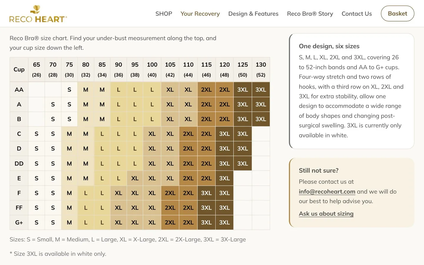
Forty-six automated tests also check the sizing every time I build the theme, and if a change would send somebody to the wrong size, the build stops and refuses to produce a file. On most websites that would be excessive, and I would say so. For something worn over a fresh surgical wound, a wrong size is not really a returns problem.
The quiet things a rebuild turns up.
Taking a shop apart properly brings every setting into the daylight, and this one turned up a few of the expensive kind: the product showing £45 instead of £54 to some visitors, because of a tax display setting nobody had reason to look at; the Terms link at the checkout pointing to an unfinished draft page from 2020; and retired pages left without redirects, so that links from older printed materials and other websites were landing on a “page not found”. About thirty redirects went in to catch those.
None of it is dramatic, which is precisely the trouble. Nobody rings to tell you about a missing page or a price that looks wrong. They simply go elsewhere, and the site goes on looking perfectly fine to everyone who already knows their way around it.
The shop stayed open throughout. Years of orders and customers moved across, the old theme stayed installed but switched off, payments were changed over without breaking refunds on older orders, and the fulfilment company's connection was checked and restored on the day it mattered. For a shop, launch day is not a finishing line. It is a day on which nothing should go wrong, and everyone gets on with their week.
What I would take from this.
If you sell something people buy at a difficult or complicated moment, as a great many businesses do, the product page is the smallest part of the job. What earns the sale is everything around it: knowing which situation somebody is in, answering the question they are actually sitting there worrying about, and being straight with them even when the honest answer sends them elsewhere for a while.
It is also worth a careful look at whether the most useful thing on your own site is a picture: your prices, your sizes, your opening hours, the specifications people telephone to ask about. If any of it exists only inside an image, it is doing far less for you than you think.
Where it stands.
Reco Heart now has a route for each operation, a recovery hub arranged around the stage somebody has reached, a page that generously points them elsewhere, the practical administration properly dealt with, and a shop at the end of it for whenever they are ready. It is calm to read, easy to size, simple to buy from, and owned outright by the person who paid for it.
You can see it at recoheart.com (opens in a new tab).
If you sell online and have a nagging sense that your website is quietly working against you, it is worth finding out why, because it can usually be put right. You can read how I approach online shops, or send me the details and I will tell you plainly what I would look at first.